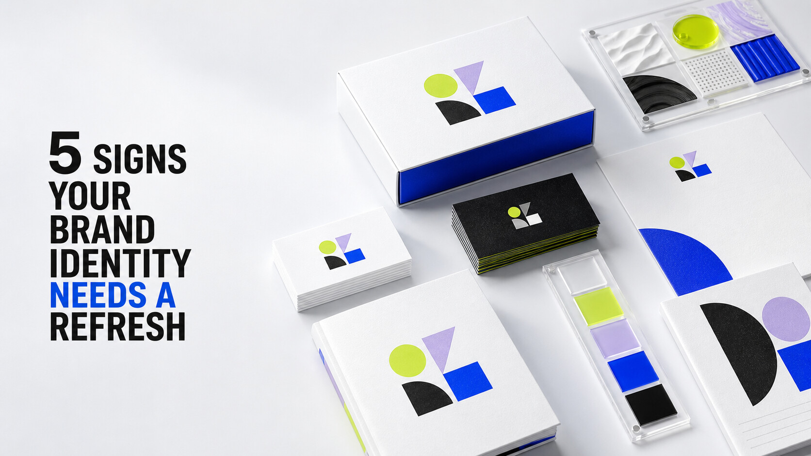
Your brand identity is the first impression most people ever get of your business — and if it hasn't changed since the day you launched, there's a good chance it's quietly working against you. A refresh doesn't mean starting over. It means making sure the way you look and sound still matches who you actually are today.
Here are five signs it's time to take a hard look at your brand, and what a refresh actually involves when you do.
01Your brand no longer matches your business
Companies grow. Services expand, the customer you're chasing changes, and the "starter" brand that felt right in year one can start to feel like it belongs to a different company entirely. If your logo, colors, or messaging describe a business you've outgrown, that's the clearest sign a refresh is overdue.
02You're inconsistent across platforms
Different logo files floating around, three shades of your "brand color," fonts that change from your website to your Instagram to your invoices — inconsistency erodes trust before a customer even reads your first word. A refresh usually starts here: one clean system, documented, so every touchpoint looks like it belongs to the same company.
03You cringe showing people your own website
This one is simple: if you hesitate before sending a client to your homepage, or you catch yourself explaining that "the new site is coming soon," your brand identity is actively costing you credibility. That feeling is worth listening to.
04Your competitors look more current than you
Design trends shift — not because good design goes "out of style" overnight, but because visual language evolves alongside how people expect to be communicated with. If a scroll through your competitors' pages makes yours feel a decade behind, it probably is.
05Your team can't describe the brand in one sentence
Ask five people on your team to describe your brand voice and see how many different answers you get. If there's no shared language for who you are and how you sound, your marketing, sales, and social content will keep pulling in different directions — no matter how good any single piece looks on its own.
A refresh isn't a teardown. It's a recalibration: keeping the equity you've already built while tightening everything that's drifted. If two or more of these signs sound familiar, it's worth a conversation.
- Start with an honest brand audit — logo, colors, type, voice, and every place they show up.
- Keep what's working. A refresh should feel familiar, not like a rebrand from scratch.
- Document the system so it stays consistent long after the project wraps.

Written by Michael — Shway Life Studios
Design. Brand. Market. The Shway Way.